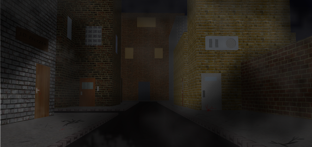
On my tutors advice, I scrapped the previous concept (itself a screenshot from a model of some streets I made on Google SketchUp, a basic 3D modelling program), and decided to go a little further with the lighting. I also felt that the fog I drew was a bit too light in colour, so I wanted to change that too.
Here's the result of my editing:
 |
| I made the image darker overall, and changed the opacity of the fog to make it less 'solid' looking. I then added several layers, and blocked out dark areas with pure black. On the next layer, I did the same, but only blocked out the areas which were darker than the previous layer. I repeated this process until my last layer only blocked out the darkest areas. I then altered their opacity levels to display them as shadows. I'm much more satisfied with this result. |


No comments:
Post a Comment