I managed to start a collaboration project with a fellow RPG Maker user in my class, Aaron. Our tutor Sonia has encouraged us to get a workable cutscene ready for the PDP hand in date, which is Tuesday!
We haven't had much time to get the stuff processed, but we're hoping to work really hard the next few days to finish something concrete.
Me and Aaron have been talking, and we decided on an RPG that makes lots of homage to other famous RPGs, by 'cherry-picking' elements from each and combining it to make something unique. We decided that the game's main location would be a fantastical island, that houses areas of varying climates and terrain. We also chose just four main playable characters (as we haven't much time), and we rustled up a story that dabbles in the themes of friendship and existentialism.
At the moment, we are in the process of creating the characters in the program, but the majority of our work will be in the scripting and layout of the cutscene that we will show our tutor.
We managed to get this finished today, and here is the link to our game cutscene, titled "Irritum Insulum". You can download it here as a zip file, and in order to play the game, double-click on the unicorn icon marked 'Game'.
Sunday, 29 April 2012
Creative Media Directions- Dissertation Proposal
My proposal for my dissertation next year is now complete! You can view it under the pages section, or click here to view it straight away.
Saturday, 28 April 2012
Game On!- Dana Monster Proposal Sheet
Here is the finalized design of the Dana monster, presented in a proposal sheet with rear, side and front views, as well as a posed form. This is subject to change as I've not yet given them designs their shiny flesh look yet.
Game On!- Monster Side View
As before, this is continuing the work on the various angles of my monsters for a proposal sheet. Here's the final one, the side view.
Friday, 27 April 2012
Game On!- Monster Front View
After showing my recent work to my tutor, Sonia, it was discussed that my monsters should be depicted in the format of a professional concept art 'proposal', with a front view, side view, rear view and then a natural pose. As I've done just natural poses, this leaves me with doing each monster from each angle. We also discussed giving the monsters a 'shiny' look that you get from severe burns, similar to preserved corpses found in peat bogs, such as the famous 'Tollund Man'.
Today, I started on a generic front view that I will use for each monster, as they are essentially the same in looks (they are burnt husks), and then alter them individually to depict each monster (such as adding Sunny's medical braces, removing Tristan's hands, altering heights, etc).
Today, I started on a generic front view that I will use for each monster, as they are essentially the same in looks (they are burnt husks), and then alter them individually to depict each monster (such as adding Sunny's medical braces, removing Tristan's hands, altering heights, etc).
Personal Practice- The Universed Poster
I've made a jokey game on RPG Maker for my friends to play, so its full of in-jokes and references to our lives in University. I'm planning to release it soon, with some little cartoons I've drawn of all of us, set to the title screens available in the program. Although not related to my University work and despite the game just being distributed among friends (not commercially), the private project gave me the opportunity to do more cartoon-like work.
Creative Futures- Eurogamer Expo 2011 Review
Just in case anyone missed it, my review for Eurogamer Expo 2011 has been up for a while but I just realised that I hadn't linked it anywhere! It's under the 'Pages' section or click here to go to the page directly!
Creative Futures- London Industrial Visit
My review of the London Trip earlier this year is now up, so have a browse of it under the 'Pages' section, or you can click here to view the page directly!
Wednesday, 25 April 2012
Personal Practice- Improved Krite
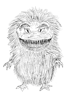
After speaking to my tutor Sonia, I've found an easy way on Photoshop to get rid of the white when I scan in my work, which will help immensely when I do future work. It seems I wasted a lot of time by trying to get rid of the white from a scanned in image. To demonstrate this, I put my original drawing of a Krite (from the Critters film series) over the digital painting, which I feel has improved the image overall, although I'm still confident that the image works without the outlines as well.
Sunday, 22 April 2012
Game On! Steven Final Concept Art
Today, I'd finalized the design of our protagonist, from my earlier sketches and the idea of him as an 'everyman'. He dons a blue formal shirt beneath a light caramel-coloured leather jacket. He wears black formal trousers held up by a silver-buckled belt, and he wears sensible black shoes. His hair is dishwater brown, with touches of lighter brown. In his late 30's, he also sports chest hair and small amounts of facial hair. He's remained pretty much the same in design since I first started this brief, and I'm pleased with the image being finalized.
More images are incoming of the development of this image.
 |
| Full view of Steven in his clothes. |
 |
| A closer head profile. |
Saturday, 21 April 2012
Game On! Monsters Final Concept Art
This week, my partner on the brief (Chris) started modelling one of the monsters in ZBrush, and so we discussed the final appearance of the monsters. The final decision was to make them extremely thin and zombie-like, with only minimal flesh left on the skeleton. Their faces would be skull like, and the body would be emaciated, especially just under the ribcage. To distinguish the monsters apart, some of the unique identifiers in my original concept art have survived in the final image: Sunny retains her augmentative gear, and Tristan's missing hand has been expanded to both hands, and his radius bones stick out with sharpened points (as a reference to Dead Island). The Dana monster is the more generic one, only bearing a few strands of hair on her head.
More images are coming soon of the method used to do these images.
 |
| Dana is now the more stereotypical monster in Ignis Lake, bearing nothing unique except a few strands of hair on her head. |
 |
| Sunny has become a lot more thinner and charred, but still retains her unique medical braces. |
 |
| Tristan is now a lot bigger and imposing, as well as more threatening with his snapped radial bones protruding from his wrists. |
More images are coming soon of the method used to do these images.
Saturday, 14 April 2012
Game On!- Bauchwitz Home Concept Art
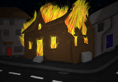
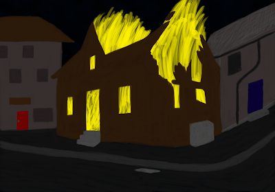
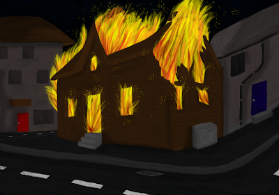
Today, I was working on one of the game's iconic images, of the Bauchwitz family home succumbing to flames. Here's the image in stages of development:
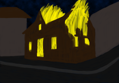 |
| As before, the basic shapes of my composition are put in place. |
 |
| Then slightly more complex shapes as well as some basic textures and shadows. |
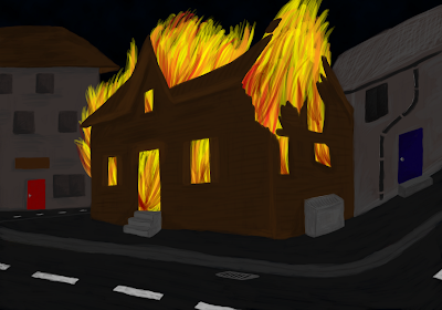 |
| I added lots of smaller details like road markings, pipe brackets, and a lot more shadow and definition on the buildings. |
 |
| I made the fire a lot more detailed by having it flow out of the house's windows and doors, as well as adding flaming bits of soot and debris. |
 |
| To add even more definition to the image, I added much deeper and darker shadows to the whole thing. |
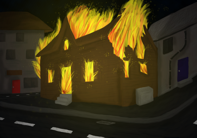 |
| To finish the image, I added yellow tinted light and 'flakes' on a seperate layer, with only minimal opacity to give the effect of light. |
Thursday, 12 April 2012
Game On!- Empty Streets Concept Art
I used the really simple 3D modelling program Google SketchUp to make a simple street with buildings. I then positioned the camera at a suitable angle, and exported it as a PNG. I'm planning to work on it extensively to create a shot of Ignis Lake's empty, dilapidated streets for my brief.
I then decided I wasn't happy with the absence of a building in the background, so I went back into SketchUp and did some more work. I also removed the program's latent fog effects, which I wanted to do Photoshop afterwards.
 |
| I wasn't satisfied as there was nothing in the background. |
I then decided I wasn't happy with the absence of a building in the background, so I went back into SketchUp and did some more work. I also removed the program's latent fog effects, which I wanted to do Photoshop afterwards.
 |
| I felt this image was much better, as the town looked a lot more believable. |
 |
| First, I altered the sky to make the environment nocturnal. |
Wednesday, 11 April 2012
Game On!- Psychiatrist's Office Background Concept Art
I started painting the office of Dr. Cardone as one of my final concept pieces. However, I'm finding this process a lot more laborious than characters, obviously because I'm filling the entire canvas with colour. At this moment, I've only just completed the first stage really, of putting down block colour on two layers: the first one was extremely rough, while the second layer tightened up the edges and forms.
After adding shadows and detail in the third layer, the image was pretty much finished. I then added lighting effects and textures to certain parts of the picture.
After adding shadows and detail in the third layer, the image was pretty much finished. I then added lighting effects and textures to certain parts of the picture.
 |
| First layer, really rough blobs of colour. |
 |
| Second layer, sharpening up the shapes of colour in the room. |
 |
| The details have been significantly enhanced, with outlines and shading all over. Additionally, I rendered lighting effects from the lamp. |
 |
| The lighting effects have been further improved, with darker shadows and brighter lighting. |
 |
| To finish the image off, I added textures to the carpet areas and the walls to make them look a lot more realistic. |
Tuesday, 10 April 2012
Personal Practice- Krite from 'Critters' film series
This time when I was practicing, I didn't use any reference for the colouring of the Krite, since I've watched the films so many times that I've memorialized what they look like. It was also good practice to colour and paint using my own intuition, as I can't paint from reference all the time as I'll be relying on my own imagination for the most part. Painting the Krite took the same amount of time as Sora, and I've learned that painting this way takes a lot less time than my usual method, AND it looks ten times better paradoxically. I'm now looking forward to doing the concept work for my brief, as I'm a lot more confident in my digital painting skill.
Here's the Krite in stages:
Here's the Krite in stages:
 |
| Like before, started off with just large blobs of colour, then I neatened up edges and erased part of the fur to make it look more like the edges of fur. |
 |
| Added more definition to the fur, face, mouth and eyes. I shaded the claws and feet very roughly. |
 |
| I added a lot more fine detail to the face, such as folds in the skin and definition around the eyes. I also added more detail to the fur, claws, feet, etc. I also added the teeth of the creature. |
Sunday, 8 April 2012
Personal Practice- Sora from KH
As I seem to keep going back to a cartoony style of working, I wanted to take some time to learn a different working method on Photoshop, as a lot of my peers in University do a more traditional painting style, whereas I scan in sketches and colour them in.
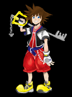
I found a really useful tutorial on how to begin to learn digital painting, by practicing from actual pictures first. Here's the page containing the tutorial, which I found incredibly useful. I decided to use one of my favourite video game characters, Sora (from Square Enix's Kingdom Hearts series) to practice with.
I was extremely pleased by the outcome, although I can see room for improvement. Here's the process in stages:
After this, I wish to do one more practice on another of my favourite characters: the Krites from the 'Critters' horror film series, in order to perfect this technique as the one above is my first attempt. I hope to use this technique when doing the concept art for my Game On! brief, as the cartoony style of my current work doesn't fit in properly.
I found a really useful tutorial on how to begin to learn digital painting, by practicing from actual pictures first. Here's the page containing the tutorial, which I found incredibly useful. I decided to use one of my favourite video game characters, Sora (from Square Enix's Kingdom Hearts series) to practice with.
I was extremely pleased by the outcome, although I can see room for improvement. Here's the process in stages:
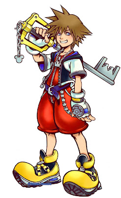 |
| Here's the original image of Sora, by Japanese concept artist Tetsuya Nomura. |
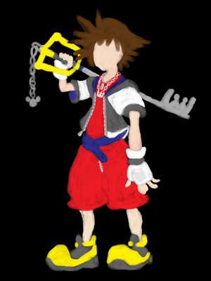 |
| I added rough 'blobs' of the main shapes in the image first. |
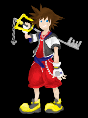 |
| I then added the more smaller shapes in the image, and started added basic shadows and lighting. |
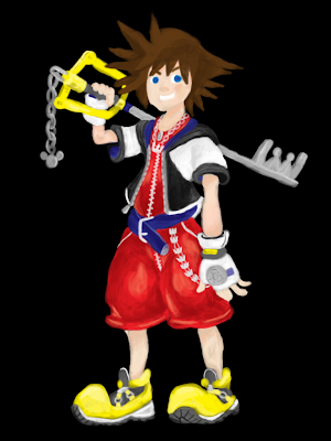 |
| I got more advanced with the shadows and the shapes in the image and started to flesh it out in terms of lighting and form. |
After this, I wish to do one more practice on another of my favourite characters: the Krites from the 'Critters' horror film series, in order to perfect this technique as the one above is my first attempt. I hope to use this technique when doing the concept art for my Game On! brief, as the cartoony style of my current work doesn't fit in properly.
Tuesday, 3 April 2012
Creative Futures- Creative Futures Week 2012 Review
My review of Creative Futures Week 2012 is now finished, and is under the 'Pages' Section, or you can click here to view the page directly!
Game On!- More Scan Ins of Sketchbook Work
Here's even more sketchbook work for my game brief:
 |
| Sketch of Dr. David Cardone, the game's psychiatrist. |
 |
| A sketch of Tristan in a style more reminiscent of my partner' Chris' interpretation of the monsters, as fleshless, burning husks. |
 |
| Dana, as a human. |
 |
| The protagonist, Steven, fleeing in fright. |
 |
| A sketch of Cardone's office in Briar Falls. |
 |
| Sunny, as a human. |
 |
| Tristan, as a human. |
Personal Practice- Zombie Girl
Another piece done for fun, from one of my old sketchbook drawings.
Edit: After talking to my tutor on the 24th April, I managed the make the image even better by removing all traces of white around my original drawing:
Edit: After talking to my tutor on the 24th April, I managed the make the image even better by removing all traces of white around my original drawing:
Monday, 2 April 2012
Personal Practice- Random Doodle Work
Here's some stuff I've just done for fun in my sketchbook. I uploaded them, edited them slightly with Live Trace on Illustrator, and then coloured them in Photoshop:
Subscribe to:
Comments (Atom)


